Therapist Branding for Texas Practices: Inside Strength InSight Counseling’s Rebrand
Filed Under
A few weeks ago, right in the middle of the last round of website edits, I got an email from my client, Vitor, with a video attached. It was footage of him riding his motorcycle, accompanied by a very casual request asking if we could use it somewhere on the site.
I’ve built a lot of therapist websites at this point, but this was definitely a first!
And if I could have given him a high five through my computer in that moment I would have because any time a therapist branches out from the blank-slate, vanilla persona that’s so prevalent in this industry, it’s considered a win in my book!
I work with therapists throughout Texas, with a hotspot in Austin and Dallas, who have reached the point where the quality of their work has outgrown the brand representing it. Vitor’s project has been one of my favorites from this year because it became such a good example of what therapist branding can look like when we’re less concerned with making a therapist look like a therapist and more interested in figuring out what makes this particular therapist worth remembering.
Meet Vitor: Branding a Practice for High Achievers, Veterans, and Immigrants Across Texas


Vitor is based in Austin and works via telehealth with men across Texas, Washington, and Florida. His specialties include high achievers, executives, veterans, and immigrants, which at first glance can look like several very different audiences sharing the same practice.
Spend a little time talking with him, though, and the connection becomes much clearer.
Designing From Lived Experience
Vitor has lived many of the experiences his clients are navigating, both as a veteran and an immigrant himself. That perspective showed up throughout the project in ways that were incredibly helpful from a design standpoint. When we talked about language around living a hyphenated life between two cultures, or whether a stock photograph actually represented a veteran respectfully instead of reducing him to a familiar stereotype, he could articulate exactly what felt off and why.
That kind of specificity makes for a really collaborative branding process. My job isn’t to layer an aesthetic over someone’s work and make it look polished, it’s to listen closely enough to understand what is already there, then translate those qualities into something another person can recognize before they’ve ever stepped into a therapy session.
The Challenge: When a DIY Website Undersold Serious Therapeutic Work
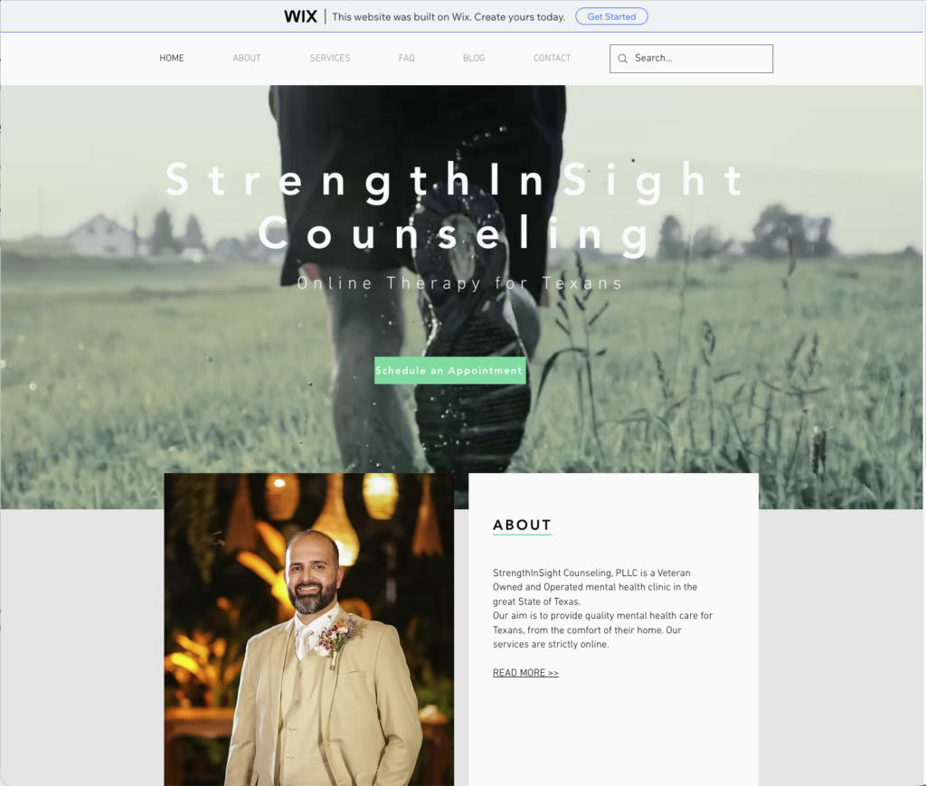

Vitor came to me the way a lot of my favorite clients do, a little sheepish about his existing website.
It had started on Wix, migrated over to WordPress somewhere along the way, and by the time he reached out, it had become glitchy, generic, and pretty disconnected from the caliber of work happening inside his practice. Looking at the old site, it would be hard to discern how thoughtful and intentional he is with his clients.
He was also very upfront about budget from our first conversation, so we built a scope that worked for him and, importantly, made his CPA happy too. If I could bring one piece of advice to every client I work with, it’s to know your working budget, and be transparent about it with your designer so she can create a solution that feels aligned with your business goals and profit margins.
When Your Brand Starts Affecting What You Charge
One of our early conversations was about his hourly rate. Partway through the branding process he raised them, something we had discussed early on as a goal, and then raised them again shortly before launch as the new brand began to feel more representative of where his practice actually was.
Branding is the ideal solution if you’re wanting to increase your rates. An outdated brand can undermine the perceived value of your services more than you might expect! When the public-facing version of your business consistently feels several steps behind the actual work you’re doing, it can influence the opportunities you pursue, the clients you expect to attract, and even what you feel comfortable charging.
For Vitor, the goal was never to make the practice simply look more expensive, but to instead upgrade the packaging of his brand to match the value he was already providing.
The Semi-Custom Website Redesign for Strength InSight Counseling

Vitor hired A.D. Press for a brand identity and a semi-custom website design, and the project ended up being a particularly good example of why that model works for clients who don’t necessarily walk into the process with a perfectly articulated visual language.
He’ll be the first to tell you that describing his design preferences in the abstract isn’t his favorite activity. Give him something tangible to respond to, however, and he can tell you precisely what works, what doesn’t, and why.
He approached onboarding in much the same way. Rather than asking me to recreate a particular website or aesthetic, he shared inspiration alongside his reasoning for why he responded to it. That gave me enough information to design toward the spirit of what he wanted without turning his inspiration board into a literal brief.
Finding the Thread Between Multiple Niche Audiences

Many agencies will tell you you have to niche down to be successful but I don’t buy that for second.
The biggest breakthrough came when we stopped looking at his specialties as separate audiences. Veterans, executives, and immigrants can appear to have very little in common on paper, but underneath those labels was a much more interesting shared experience. Vitor works with people who are highly capable, accustomed to carrying responsibility, and often navigating pressures or expectations that the people around them don’t fully understand.
Once we could name that, the visual direction had something much stronger to organize itself around.
The Story Behind the Strength InSight Counseling Logo

The final identity centers around a structured stacked wordmark with a custom semicolon woven into the visual system. The mark has a topographic quality to it, with contour-like lines that reference terrain, movement, and the experience of finding your way through something that isn’t necessarily linear.
The semicolon underneath that visual idea carries a much more personal significance.
For Vitor and many of the veterans and officers he works with, the semicolon represents continuation. This isn’t the end. There is still something on the other side of this moment. It can also hold a quieter message between people who understand that experience, something closer to I’ve got your back.
I loved that the mark could hold both ideas without becoming overly literal. The topographic element gave us a way to reference difficult terrain and forward movement without defaulting to another mountain logo, while the semicolon gave the symbol an emotional meaning that was genuinely connected to Vitor and the communities he serves.
More importantly, none of that meaning has to be understood for the logo to work. Someone can simply see a strong, structured mark that feels appropriate for the practice, while the people who recognize the deeper symbolism get another layer entirely.
Those are usually my favorite kinds of brand details. They can be felt before they ever need to be explained.



Finding Veteran Photography Without the Clichés
Photography ended up requiring almost as much thought as the logo. Finding images of veterans and executives that didn’t immediately fall into stereotype took considerably more digging than I expected, even across my paid libraries. At one point Vitor asked, half jokingly, if he could “vet the vet images” before we committed to anything. A few hours of stock-photo searching later, it had become a legitimate part of the process.
That attention matters when you’re building a therapist brand around the experience of being deeply understood. The imagery can’t immediately tell the person viewing it that we don’t understand them at all.
Why Semi-Custom Worked for This Project
For practice owners who struggle to articulate design preferences the way Vitor initially did, this is also where a semi-custom website can be incredibly useful. Instead of starting with a blank page and expecting you to invent a visual direction, we begin with a strong framework and give you something tangible to respond to, refine, and ultimately make your own.
The Results: Faster, Mobile-Ready, and Built for Where His Clients Actually Are
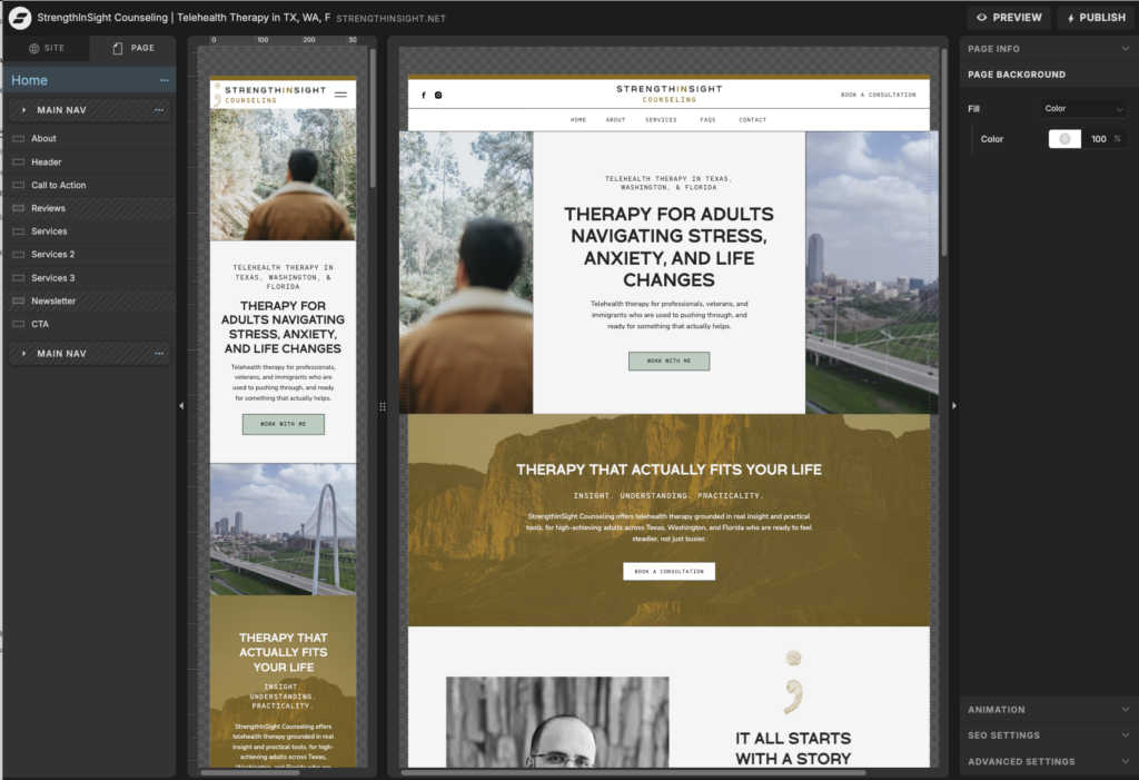
A Better Technical Foundation
The new site has only been live for a short time, so we’re still too early for meaningful booking or organic search data. What we can already see is a significant improvement in site performance, with a faster website, stronger mobile responsiveness, and a structure designed to give Vitor a much better foundation for search visibility moving forward.
Mobile performance is especially important for his telehealth practice. Prospective clients throughout Texas are often discovering and evaluating therapists from their phones, and the old website simply wasn’t built to hold up particularly well in that environment.
Building Toward Long-Term SEO Visibility
We’re also connecting the new site to Google Search Console so that we can watch how it performs in actual search results over time. I think that’s an important distinction when we talk about SEO. Launch isn’t the moment we declare a search strategy successful, it’s the point where we’ve finally built the infrastructure necessary to collect useful data and start making decisions based on how people are actually finding the practice.
From here, Vitor has a much stronger foundation for making future content and SEO decisions based on evidence rather than guesswork.
In Vitor’s Own Words
Vitor isn’t a big-reaction kind of client, which I came to appreciate pretty quickly. His feedback is thoughtful, specific, and measured, so when a revision round comes back with almost nothing to change, I know we’ve landed where we need to be. That’s exactly what happened toward the end of this project.
Here’s what he shared during the branding process: “I especially like that the direction does not rely on common therapy symbols or overly soft wellness imagery. The overall tone feels more refined and differentiated than what I often see in mental health branding.”
Later in the process, he expanded on what was working:
“Overall, I like the tone, color palette, typography, and more structured direction. The identity feels calm, mature, professional, grounded, and differentiated from typical therapy/wellness branding… The strongest direction for me is the stacked wordmark with the semicolon concept. The STRENGTH / INSIGHT / COUNSELING structure feels clear, grounded, and usable. The semicolon adds a personal and emotionally meaningful layer that feels more aligned with the brand than the topographic mark by itself.”
The Moment I’ll Remember From This Project
Every project seems to leave me with one small detail that I remember long after the website itself has launched, and for Vitor, I think it will always be the motorcycle video.


Vitor is incredibly steady and serious about his work, but there’s also a dry, slightly corny sense of humor underneath it that showed up throughout the entire process. It came through in his client portal messages, in our conversations, and in the fact that this very grounded, unshakeable veteran was also consistently one of the quickest clients I’ve ever had to reach for an emoji reaction in the portal chat.
Those details may seem unrelated to branding, but I don’t think they are. They’re often the things that keep a person from disappearing behind a polished collection of credentials. The more of that humanity we’re able to preserve in a professional brand, the less we have to rely on generic design choices to manufacture personality for it.
FAQ: Therapist Branding and Website Design for Texas Practices
What’s included in a semi-custom website for therapists?

A semi-custom website starts with a strong professional framework rather than a blank page, which means you’re responding to real layouts, hierarchy, and design decisions instead of being expected to describe an entire visual direction from scratch.
For therapists who know what they like when they see it but don’t naturally speak in design terminology, it can be an especially good fit. You can explore A.D. Press’s semi-custom website service to see the full scope and how the process works.
For this project, we utilized our in-house Showit template, titled, Athena. Its classic design with creative compartments and line work is highly suitable for therapy sites who serve multiple populations.
Why does mobile-responsive design matter for a therapist website?
Prospective clients are often looking for a therapist from their phone, sometimes in a moment that already feels vulnerable or overwhelming. A website that loads slowly, breaks on mobile, or makes basic information difficult to find introduces unnecessary friction at exactly the wrong point in that decision.
Responsive therapist website design isn’t simply a technical consideration. It’s part of creating a clear, accessible path between someone realizing they may need support and feeling confident enough to reach out.
How do you find photography for therapist branding that doesn’t look like typical wellness stock imagery?



It takes considerably more digging than most people expect, particularly for populations like veterans, executives, and high achievers, who tend to be represented by the same handful of visual clichés across stock libraries.
Building a more differentiated therapist brand means being willing to keep looking and rejecting perfectly nice images when they don’t actually represent the people the practice serves. Photography is part of positioning too, and in Vitor’s case, getting those details right was just as important as choosing the right typography or color palette.
When Your Practice Has Outgrown Its Brand
Congratulations to Vitor on a brand and website that finally feels proportionate to the work he’s doing every day with his clients! You can see the finished site at Strength InSight Counseling.
If your own practice has reached the point where the work has outgrown the brand representing it, A.D. Press offers therapist branding and website design for practices throughout Texas, and across the country. I’d genuinely love to hear what you’re building and help you figure out what the right next step looks like. Click here to book a complementary consultation and we can discuss your goals over a virtual coffee date!